Welcome to my weekly Operation Melt update where I share progress updates from my continued fitness journey and the important lessons it is teaching me about life.
Bad Measurements
Sometimes the things I measure don’t go the way I want them to go.
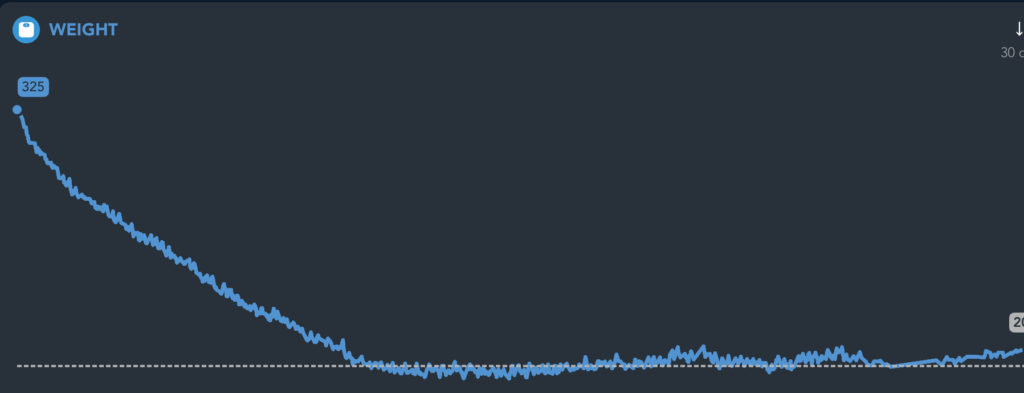
My weight is up…
Rain kept me from running…
My run was slow…
I over-consumed calories…
I couldn’t lift as much as normal…
All of these things are real things that have happened to me over the past few weeks. So, as you would expect because of how numbers-driven I am, I was pretty frustrated when each of these things occurred. Nothing feels worse than eagerly stepping on a scale or finishing a run and looking at the result only to be disappointed. It sucks!
But each of these metrics is likely to fluctuate from day to day so there is a better approach to prevent this daily frustration.
Nerd Alert: Charts and Graphs
Being the data nerd that I am, I have recently created 2 spreadsheets with corresponding graphs.
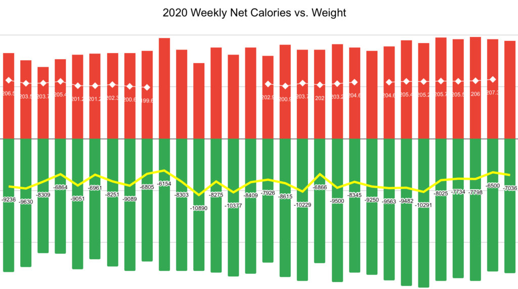
The first compares my weekly calorie consumption vs. total weekly calorie burn vs. average weekly weight.

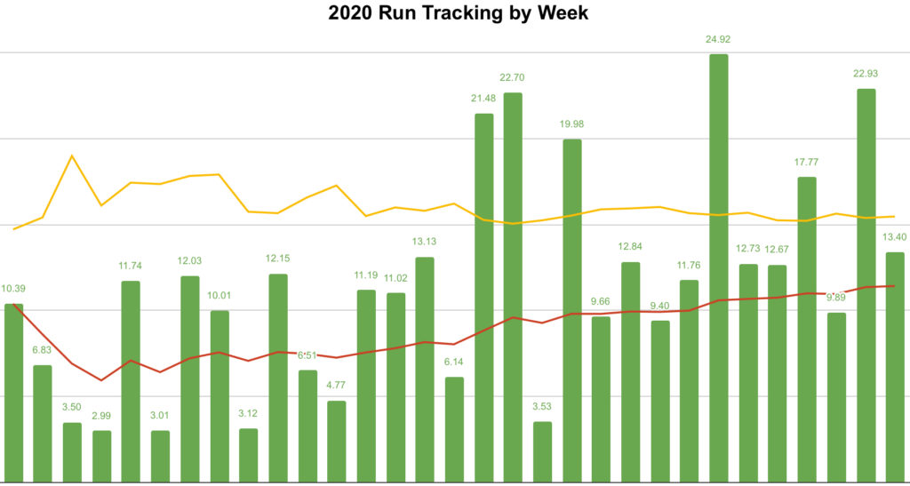
The second spreadsheet captures my total weekly running distance as well as my fastest and slowest run times through that week. Year-to-date 30 weeks have elapsed so I have quite the sampling of data and it tells the story about how much things change from week to week.

In addition to the weekly measurements, I added one more important item to each graph: a line. On the first graph, I added a line that tracks my rolling weekly calorie deficit (calories consumed minute calories burned). On the second graph I added a line tracking my rolling average miles ran per week and another that tracks my fastest run per week.
By looking at these trend lines I have learned a lot about these measurements that were so disappointing when I looked at a couple of bad days.
I am actually continuing to run more miles week over week. This especially increased when the COVID lockdown started and I reinvested my work prep and commute time into my exercise goals.
My average weekly calorie consumption has increased since the COVID lockdown in March. But my weekly calorie burn has increased by twice as much as the consumption. So I am not only maintaining a strong calorie deficit each week but I am overdoing it which likely has actually led to my weight increase. Counterintuitive for sure, but I need to start eating more each week… of all the bad luck, right?
My runs are not getting slower, but they also aren’t getting much faster. I am consistently (over the past 3 months or so) averaging a pace of between nine minutes and nine-and-a-half minutes per mile. I am happy with this pace, but would like to see continuous improvement. Unfortunately, I heard that we lose a little speed every year after age forty, but I refuse to accept this.
Lines vs.Points
What I have learned through this exercise is that we need to keep the right perspective on points versus lines. An individual data point is important. It tells a story. My weight today reflects my choices from yesterday. Ironically enough, my running speed today also tends to reflect my choices from yesterday. These individual measurements, these points, are very important.
Individual measurements, single points, are not sufficient by themselves. To really understand performance you need to look at a line. A line tells the story of performance over time which is way more important than any one point on that line.
Without looking at my lines, I would not have really known if I am getting slower, lazier, fatter, weaker or any of these things. Ok, that’s not a healthy way of looking at it, but it made me chuckle a bit so I liked it!
But lines are comprised of all the individual points so they are still important because the points are what I can manage every day.
What do your lines say?
Do you have a goal that you are pursuing? Are you tracking your progress? What does your trend line tell you?
Are you trying to become a millionaire? What does your net worth trend line say? Ignore today’s measurement, it could be heavily impacted by day-to-day changes in the value of your investments. What does the line say about your net worth over time? Is your net worth increasing over time?

Are you trying to lose weight? Today’s measurement from the scale will be impacted by yesterday’s food, drink and exercise. What does the line tell you? Is your weight decreasing over time?

When you are chasing a goal, every single measurement point matters. But individual points don’t tell the story. When you start looking at the line of your points over time you can really see the story unfold before your eyes. This may mean that you need to make a change and take action, then do it. The line may also tell you that you are on track despite one bad day or week. Wouldn’t that be nice?
I want to hear from you!
I’d love to hear your thoughts on today’s post, your goals or anything else on your mind. Send me a note via my Contact Me form above, on Facebook, on LinkedIn or via Instagram.
Get my Operation Melt updates delivered to your inbox weekly by adding your name to my email list by clicking the Email List link above.
Learn more about how I used project management as a tool for success in my weight loss journey? Pick up your copy of my book Operation Melt: How I Used Life-Changing Project Management to Lose Over 100 Pounds In Under a Year.
About Operation Melt
Operation Melt started as a blog to share my personal transformation and weight loss story. After achieving success with that goal, Operation Melt has evolved into a platform that to help inspire, motivate and equip people to achieve their own personal and professional goals so they can live their best lives. My vision is to build a world where no goal ever dies of loneliness.

 Meet Coach Tony