Goals are achieved one day at a time.
After you commit to a SMART goal and build a plan that works for you, measuring daily progress until you reach your goal is the recipe for success. But, you will have good and bad days along your journey. Trying to evaluate success based on these individual points will not be accurate and will drive you crazy.
Learn how to get a more accurate and less frustrating picture of how you’re doing in this week’s Goal Success By Choice.
Amuse Bouche
Before we get to today’s post, I offer you this light “amuse-bouche” to entertain your mind before we get down to business. Like any other amuse-bouche, you may hate my “dad joke,” but it is worth every penny that you paid for it, right?
It is very sad when parallel lines have so much in common… they’ll never meet.
Hello, I am Coach Tony… Welcome to Operation Melt!
My name is Coach Tony, and I am a coach, author and project manager on a mission. I am working to build a world where no goal ever dies of loneliness.
I almost allowed one of my biggest life goals to die without ever being attempted for forty years. My goal almost died, not of failure but of loneliness. But, I took a risk and leveraged a simple, logical process that helped me wildly exceed my goal.
I transformed my life, and you can do the same with the help of Operation Melt.
Operation Melt provides engaging, practical content and hands-on coaching to inspire, motivate and equip project managers and other left-brained high-achievers to pursue and accomplish their biggest goals.
Got Goals?
Do you have dreams that you are trying to make come true? Do you have a goal that you are trying to crush? Success doesn’t happen by chance. Success is a series of choices that can make you unstoppable. Goal Success by Choice helps you make these choices to move you closer to your goals.
This blog is my gift to you. I hope that it helps you choose to be successful and bring your goal to life. Are you ready to help build a world where no goal dies of loneliness?
One Thin Line Between Average And Successful
Follow the trend lines, not the headlines.
President Bill Clinton
Shit happens… despite my best efforts, sometimes things simply don’t go how I want them to.
My weight is up…
Rain caused my running miles to be low…
My run was slow…
I over-consumed calories…
I couldn’t lift as much as normal…
These are real things that have happened to me multiple times throughout my journey.
As you likely already know, I am a numbers guy, which meant I was pretty frustrated each time these things occurred. Nothing feels worse than eagerly stepping on a scale or finishing a run and looking at the result only to be disappointed. It sucks!
Each of these metrics, and countless others like them, are likely to fluctuate daily and can cause you to feel like you aren’t succeeding with your goals. But, there is a better approach to avoid this daily frustration and help you feel like the successful rockstar you are.
Nerd Alert: Charts and Graphs
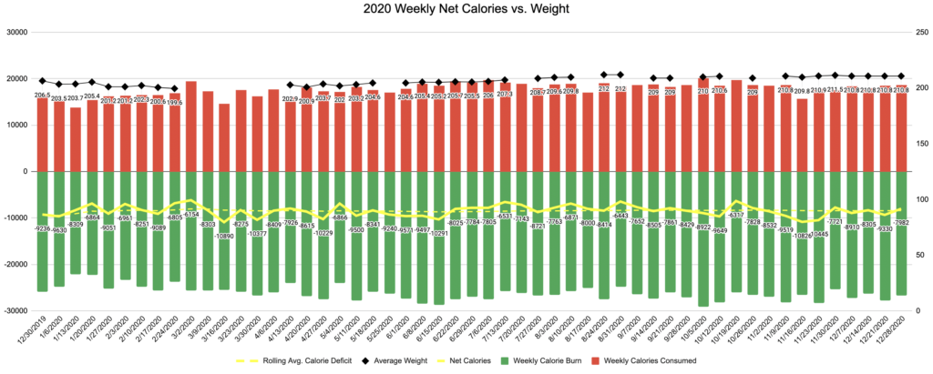
As a data nerd, I created two spreadsheets with corresponding graphs during my weight loss journey.
The first spreadsheet compares my weekly calorie consumption vs. total weekly calorie burn vs. average weekly weight. Choosing one random week as an example, I consumed 26,508 calories, and my estimated calorie burn was 15,682. This means I had a total calorie deficit of 10,826 for the week, plus my weight was down one pound from the prior week.
The second spreadsheet captures my total weekly running distance and my fastest and slowest run times through that week. Using the same week as an example, I ran 9.02 miles, and my fastest pace was 9:42.
But, each of these points only tells a fraction of the story. So I added another item to each graph to help me see the rest of the story. I added lines.

On the first graph, I added lines that track my rolling weekly calorie deficit (calories consumed minute calories burned) and my weight. On the second graph, I added lines depicting my rolling average weekly running miles and another that tracks my fastest run per week.
Looking at these trend lines, I can see stories hidden amongst the points. This is especially true when looking at the points for a bad week.
During one particularly bad week, my running mileage was very low, and I was slow. But, the line proved that this week was an anomaly, and my running mileage over time was trending much higher. Additionally, my speed steadily improved over time despite a couple of slower weeks.
On a different week, I noted that I was consuming way more calories than I was accustomed to consuming. But, my estimated calorie burn was also way higher because I was exercising significantly more than when my consumption was lower. So, my net calories represented an even larger deficit than before.
Finally, as my average weekly calorie deficit increased, my weight and average resting heart rate increased too. These were both signs of over-training, under-resting and under-eating.
Each of these stories could only be seen by looking at the lines. The individual points weren’t sufficient to tell the whole story.
Lines vs. Points
This exercise reinforced the value of focusing on lines versus points.
Goals are achieved one day at a time, and every day matters. As such, an individual data point is important. It tells a story. My weight today should generally reflect my choices from yesterday. Ironically enough, my running speed today also tends to reflect yesterday’s choices.
While individual measurements, or points, matter, they are sufficient when evaluating your performance. To really understand performance, you need to look at a line. A line tells the story of performance over time which is way more important than any one point on that line.
Without looking at my lines, I don’t really know if I am getting slower, lazier, fatter or weaker. Ok, that’s not a healthy way of looking at it, but it made me chuckle a bit, so I liked it!
Simply put, your success or failure with any goal is measured by the lines connecting all of your points, not the points themselves.
Just remember that lines are comprised of all the individual points and that the points are still important. Each point represents what we can manage every day. Your lines will never go as you hope if all of your points are bad.
What do your lines say?
Do you have a goal that you are pursuing? If not, that is the first step to success. It is time to create a SMART goal that matters to you. My Goal Success Quick Start Guide will help you do just that.
Ok, now that you have a SMART goal, are you tracking progress daily? Of course you are because how else would you know if you are on track? Right? So, what does your trend line tell you?
Are you trying to become a millionaire? What does your net worth trend line say? Don’t obsess about today’s measurement; it could be heavily impacted by day-to-day changes in the value of your investments. What does the line say about your net worth over time? Is your net worth increasing over time?
Are you trying to lose weight? Today’s measurement from the scale will be impacted by yesterday’s food, drink and exercise. What does the line tell you? Is your weight decreasing over time?
When you are chasing a goal, every single measurement point matters.
But individual points don’t tell the story. They don’t tell you if you are being wildly successful or just standing still. To figure that out, you need to draw a line.
When you start looking at the line that takes shape when you connect your points over time, you can really see the story unfold before your eyes.
This may mean that you need to make a change and take action, then do it.
The line may also reveal you are on track despite one bad day or week.
Wouldn’t that be nice?
So What
Goals are achieved one day at a time.
After you commit to a SMART goal and build a plan that works for you, measuring daily progress until you reach your goal is the recipe for success. But, you will have good and bad days along your journey. Trying to evaluate success based on these individual points will not be accurate and will drive you crazy.
You need more than one point for an accurate and less frustrating picture of how you’re doing. That’s when it is time to draw a line.
Need help figuring out what points to measure and drawing some lines between them? My graph paper is standing by.
Click Here to learn more about my Operation Melt coaching services.
Beware of the Robots!
Was this post helpful or interesting to you? Do you want to read more? Don’t trust it to the social media algorithms.
Defeat the robots by joining my email list below and get these posts delivered directly to your inbox every week.


 Meet Coach Tony